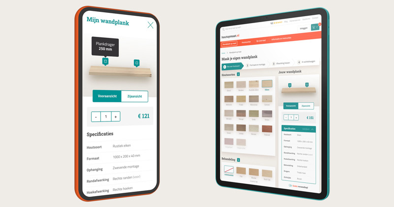
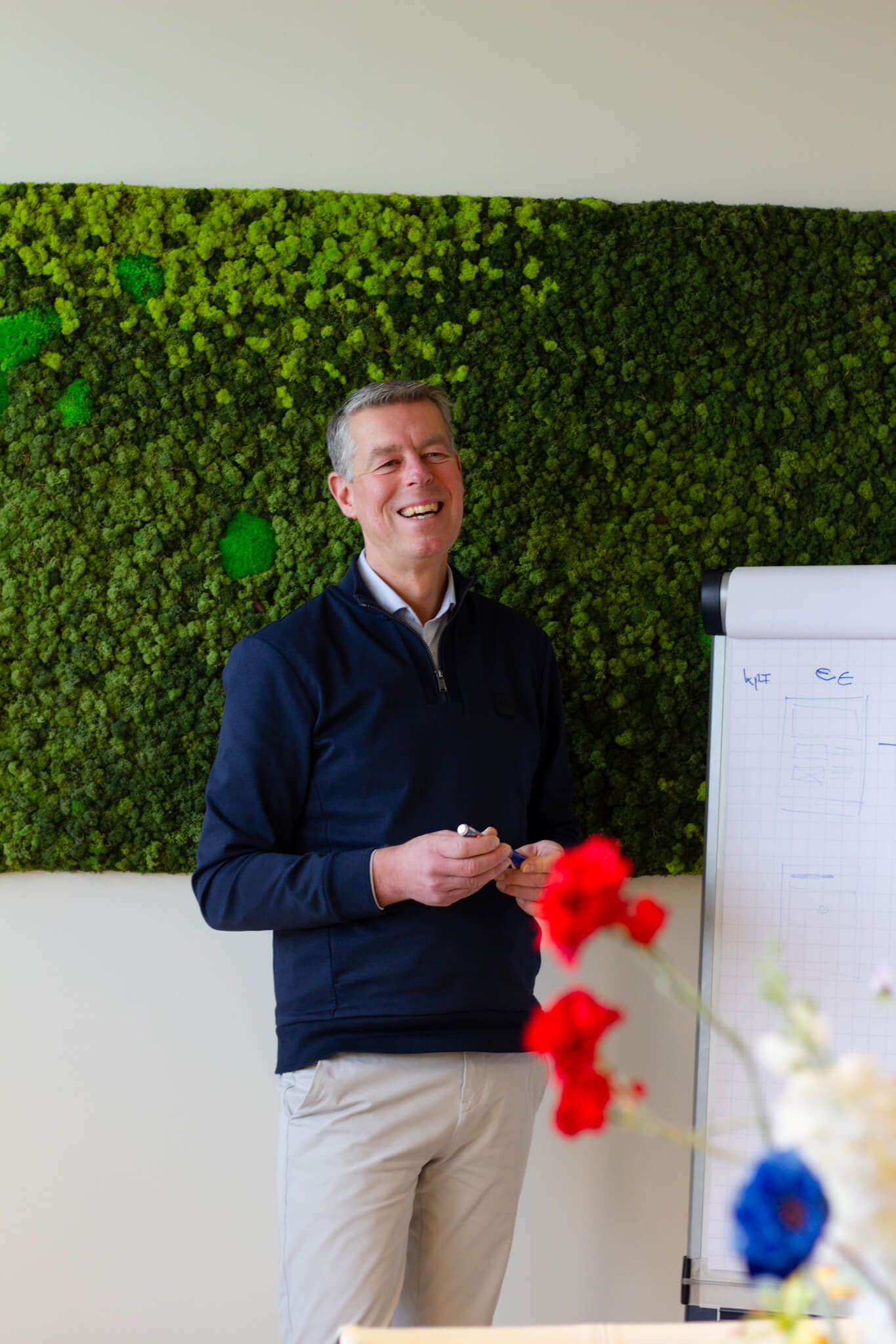
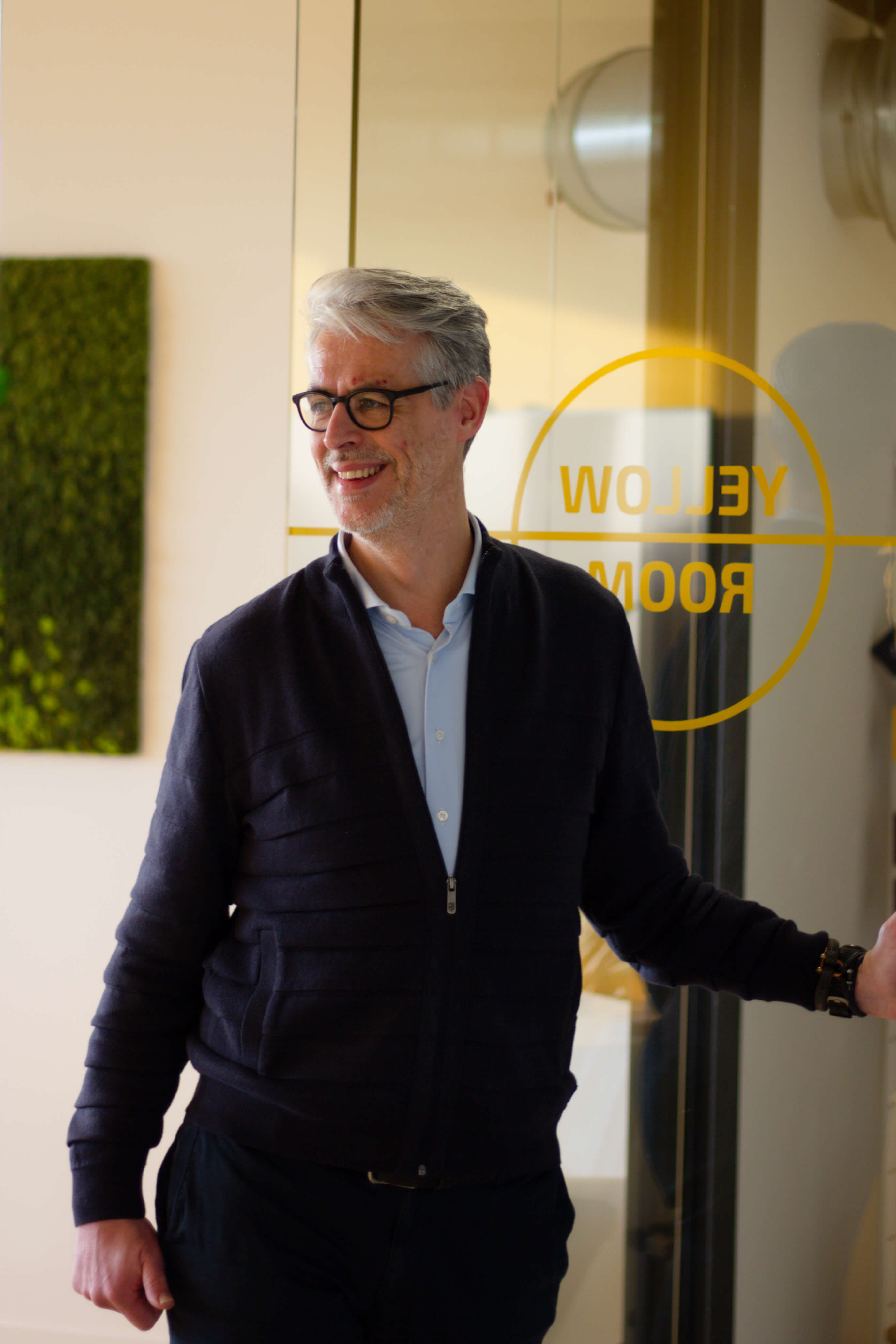
Animation that excites

22 februari 2016 Design

User interfaces are generally pretty boring. It’s just text, buttons, icons and images. Most of it is static, and generally that’s a good thing. 99% of the time you want to just click a button, and you want it to react exactly how you’d expect it to react.

But what if once in a while, that button did something unexpected? I’m not talking about re-directing you to a completely different website and throwing you out of your flow. What if the button shot out confetti when you clicked it, or lifted up to reveal something hidden. Or transformed smoothly into a confirmation check mark? These are all examples of animation that excites the user by doing something unexpected and fun.

Use cases

Twitter

By far the best examples of exciting animations in my opinion is Twitter, their iOS app is filled with them.

The moment you open the app you get the splash screen, most apps just hide the splash screen when it’s done loading. But twitter does something unexpectedly pleasant. It zooms into the logo and reveals the content behind it. They’ve designed it to be very smooth, and not take any longer than what it otherwise would be without the animation.

Another great example from Twitter, when you favorite a tweet, the star shoots sparks. It makes you want to favorite more tweets just to see the animation again. It’s a genius piece of UI animation which might actually increase conversion. Again, it’s very fast, it’s smooth and it doesn’t impede the user.

Nintendo

On the Nintendo website when you switch between views on the games page the button bounces, it makes the switch between the 2 views feel fast and smooth. The type of animation reflects its environment very well. It’s a gaming website, games are meant to be fun therefore they’ve decided to give the animation the feeling of something that's been pulled straight out of one of their games.

Apple

On the Apple website when you open the navigation on mobile, your screen is immediately taken over with fluid animations which relay context, and also make the interface feel fun and alive.

When you close the navigation the Apple logo and ‘bag’ icon pop back in as if they were hiding. The only down side to this is that it takes a long time for the animation to finish. From the moment you click the ‘hamburger’ icon to the moment you can click a button is about 2 seconds. For a navigation this is a long time.

This animation was added to a critical part of the user interface, which is a big no in the unwritten rules of web design. However a lot of websites with mobile navigation's are guilty of the exact same thing. This is, unfortunately, something we've gotten used to.

Setting a good example

In order to create good animations, you need know what a good animation looks like. I’ve found a few great snippets of what I feel are pleasant animations around the web. I feel like these set a good example for what can be done with a little time and effort.

A cool toggle switch

This concept shows a very simple toggle between biking and driving directions. The liquid like animation in the button, combined with the bounce of the content makes the app feel extremely responsive.

Creating a post on Tumblr

When choosing to create a post on Tumblr, you're greeted with an array of options, each option bounces onto the screen. It's very friendly and makes it fun to post content to the platform.

An informative & speedy download button

This concept is cool because it shows a lot of useful information in a very small amount of space. It transforms between a button, download speed & confirmation box fluidly, which helps the user understand exactly what's happening.

Pick your favorite artists

When loading up the Beats music app for the first time you're greeted with this friendly selection screen that asks you to pick your favorite genres. It's fun and easy to use design makes for a great user experience.

Conclusion

Hopefully from this post you understand the beauty of adding fun, delightful animations to a user interface. Even the tiniest things can make your website / app stand out from the crowd such as a little star that animates. Sometimes those small animations can help someone to understand your interface better and in the right context can create even more conversion.

I think we need to experiment more with these fun animations. It's a difficult area of design because they can take a lot of time to create, and they're usually an afterthought which means bundling them on top of existing UI without the correct foundations in place to make them smooth and optimized.

But in the end, it's totally worth it.